Mobile Banking
My RoleUser Experience Lead
UI Designer
ActivitiesUX Research
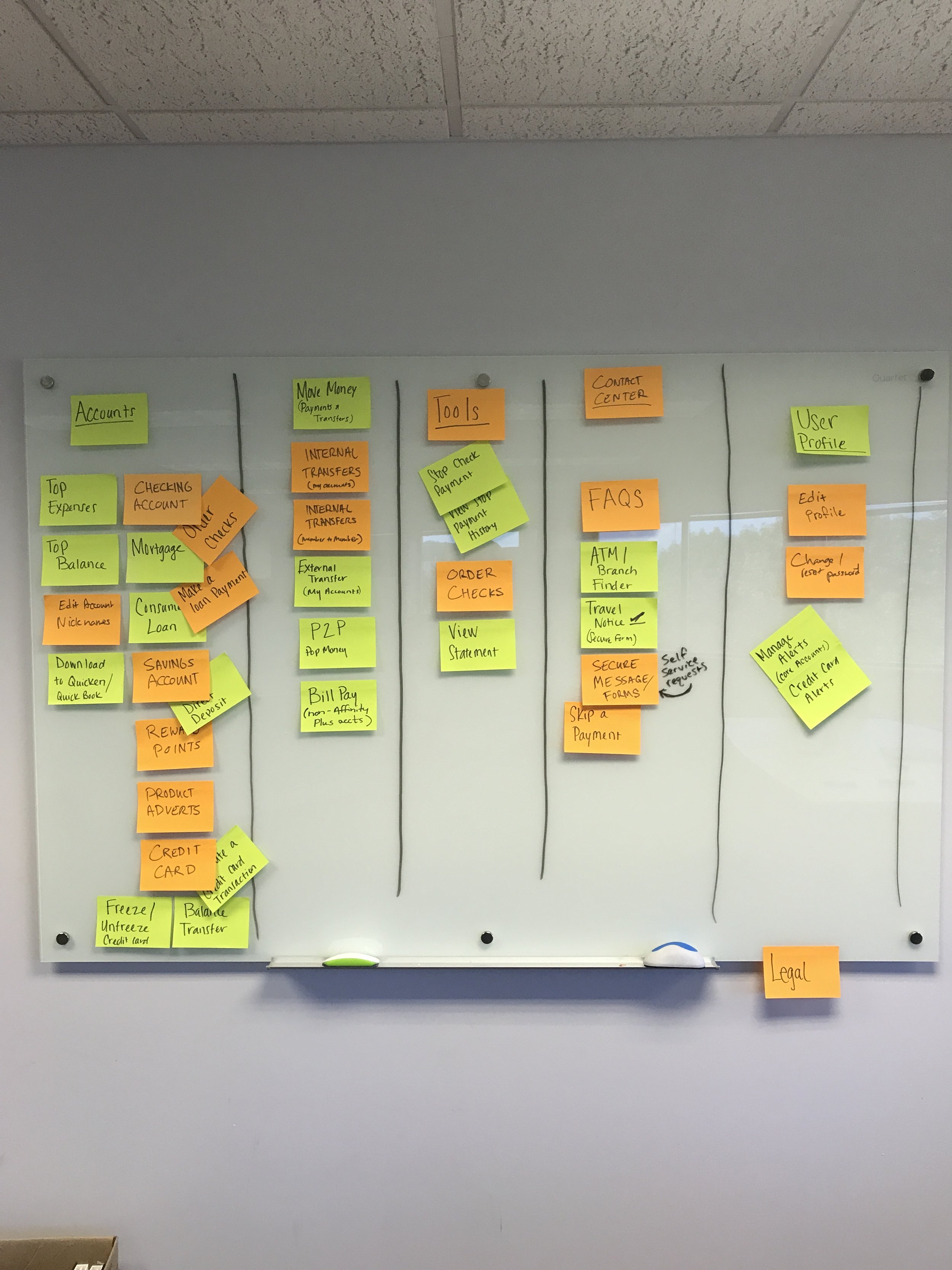
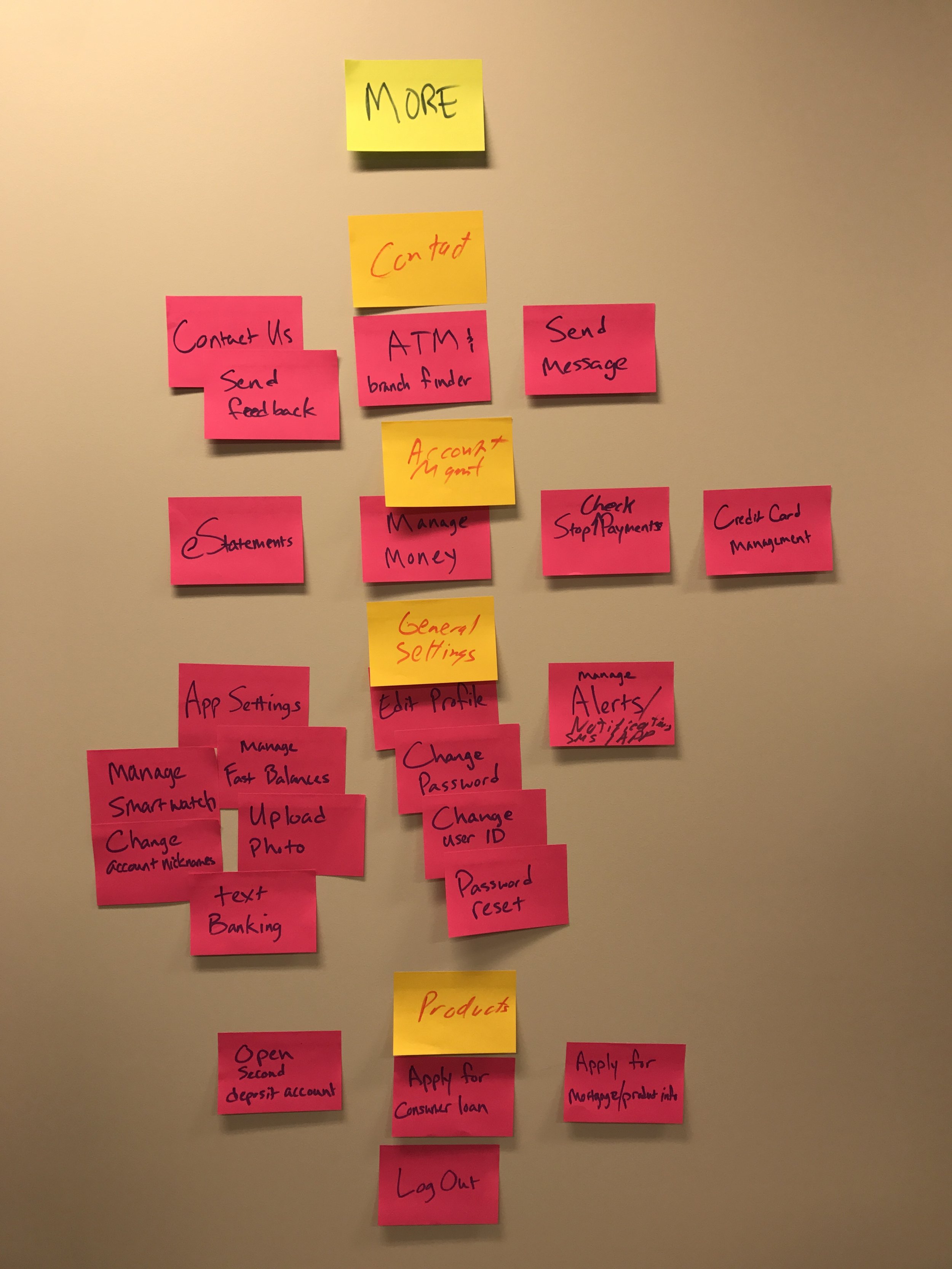
Affinity Diagraming
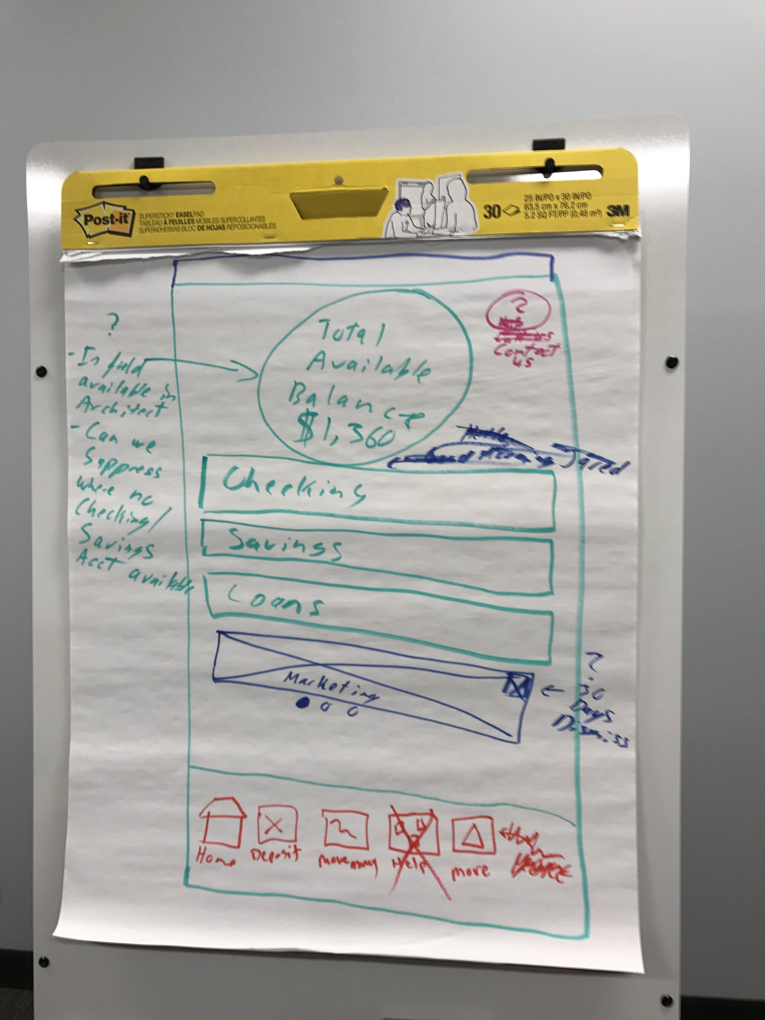
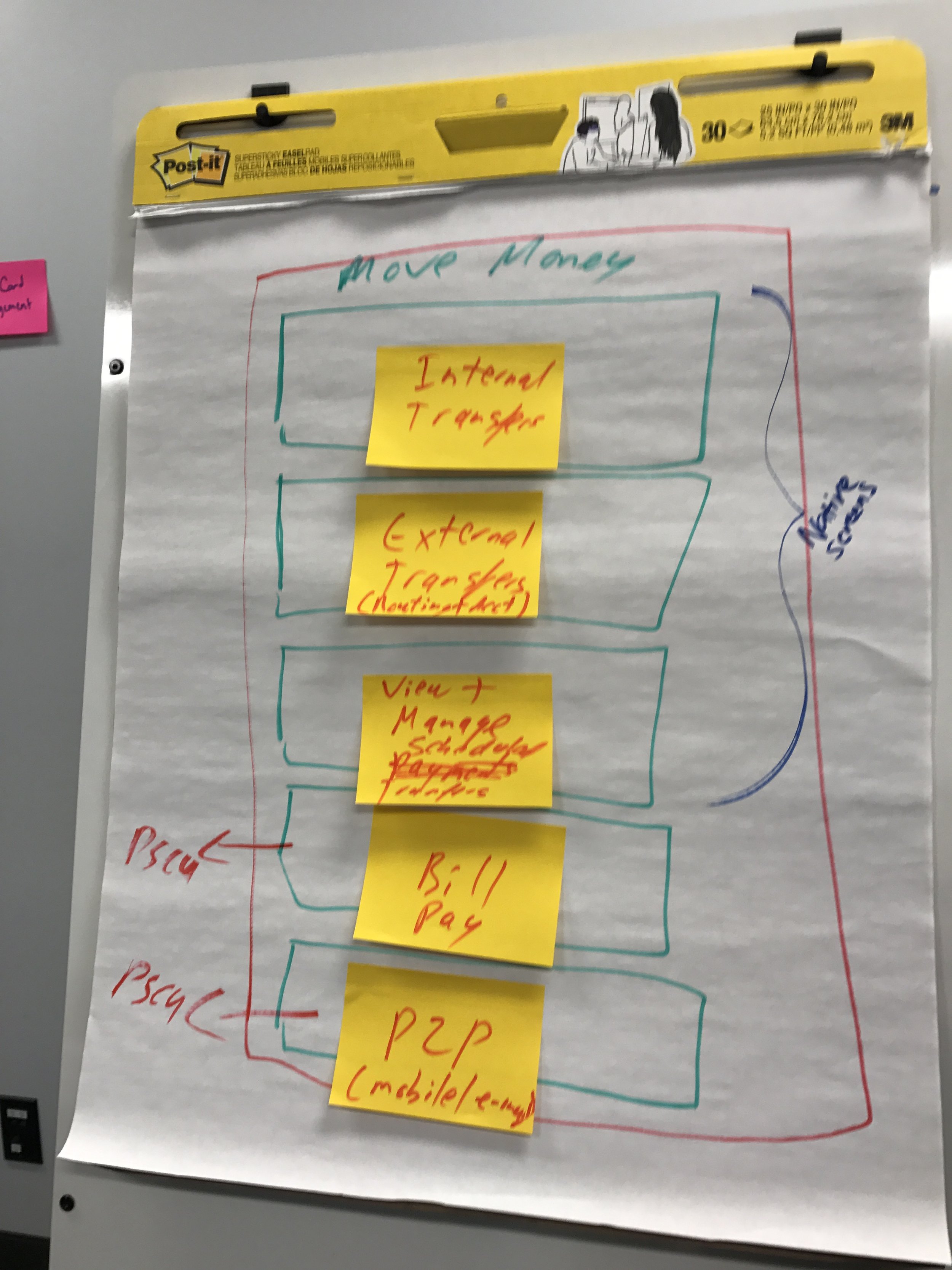
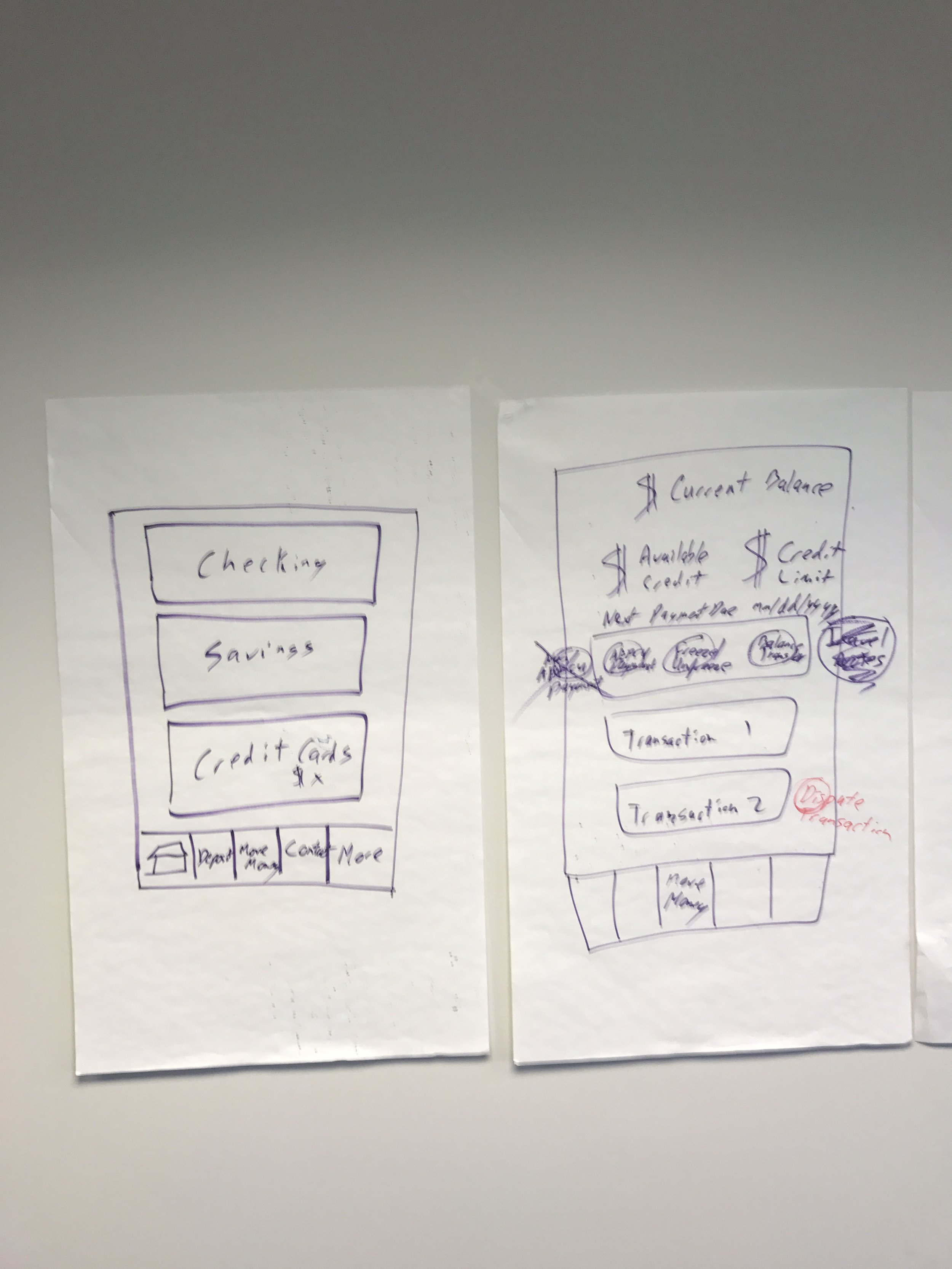
Wireframing
Interaction Design
Visual Design
Critique
Prototyping
Usability Testing
ToolsMiro
Jira
Confluence
Sketch
Abstract
Invision
Pencil and Paper
Project Overview
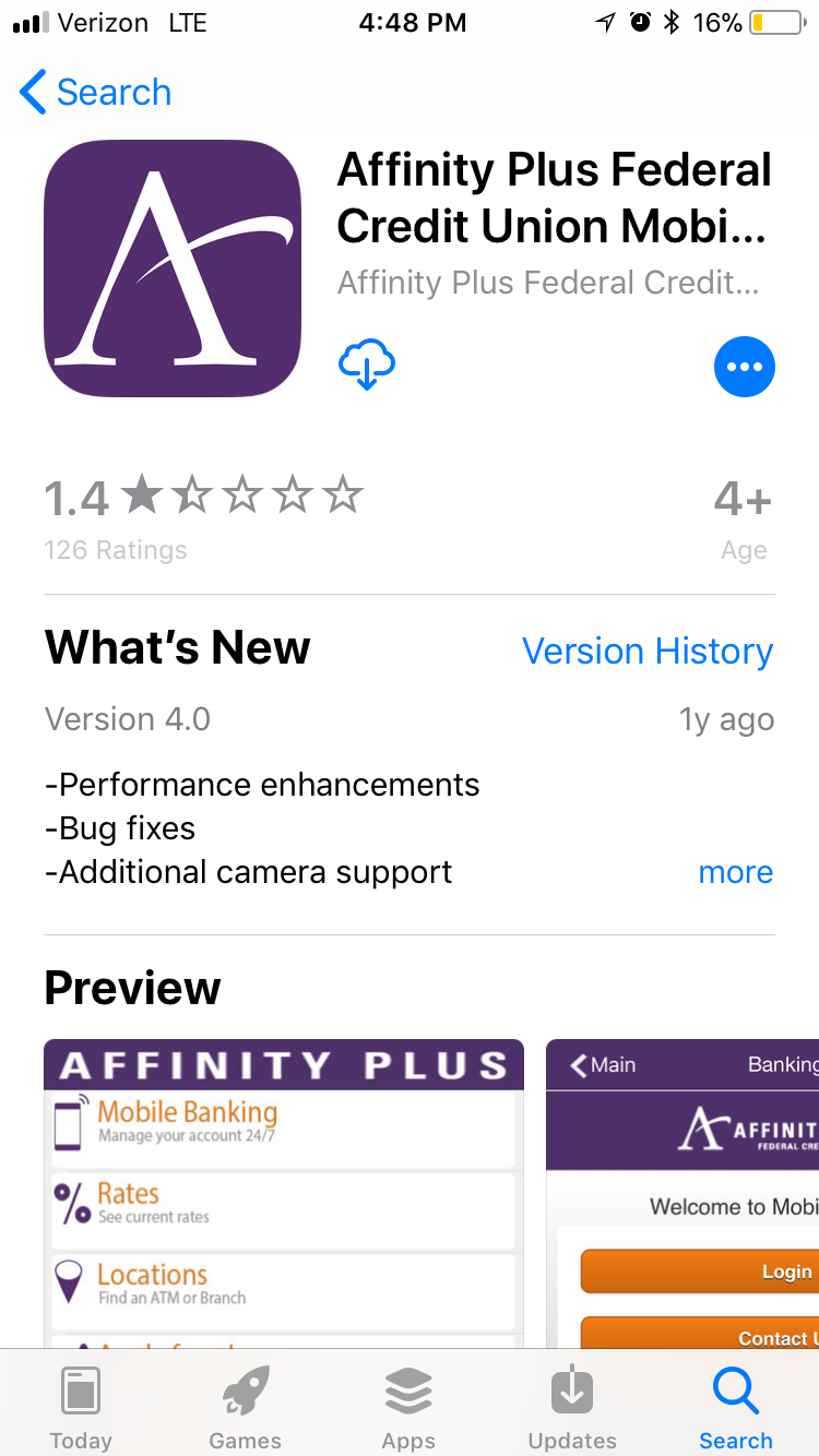
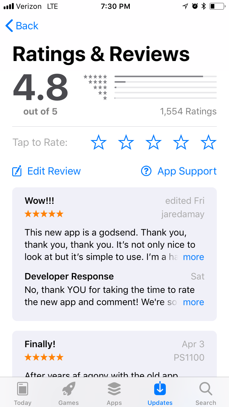
At Affinity Plus Federal Credit Union, I led the design efforts of a new internal team and partnered with external vendors to redesign an outdated mobile banking app. My efforts delivered an app with new functionality and a friendlier user experience and raised app store ratings from 1.4★ to 4.8★. Post-launch, I continued to learn from our members through qualitative and quantitative user feedback to deliver new capabilities and refine functionality. I also introduced and facilitated various human-centered design activities and up-skilled my team through our day-to-day work.
23%
increased usage in the first year
150%
Active monthly user growth
4.8★
App store ratings
Problem Space
The digital banking tools were overdue for an update and caused frustration for credit union members. Updating and maintaining the app was a secondary responsibility for the marketing and IT teams. App ratings and usage were low compared to the number of members banking with Affinity Plus. Members leaving to bank elsewhere cited the lack of a modern mobile app experience as the reason they chose to end their membership and close their accounts.
The Situation
At the beginning of an organization-wide effort to update banking technology, I joined a new team responsible for the experience design of all customer-facing digital banking products. The Affinity Plus leadership team decided to invest in updating the digital banking products and design capabilities to remain competitive with national banks and emerging fintechs. Eager to take on the challenge, I joined as the organization’s first dedicated UX Designer. As a foundational member of a new user experience design team, I was responsible for leading the redesign of digital banking products and introducing user experience design practices to the organization.
Action
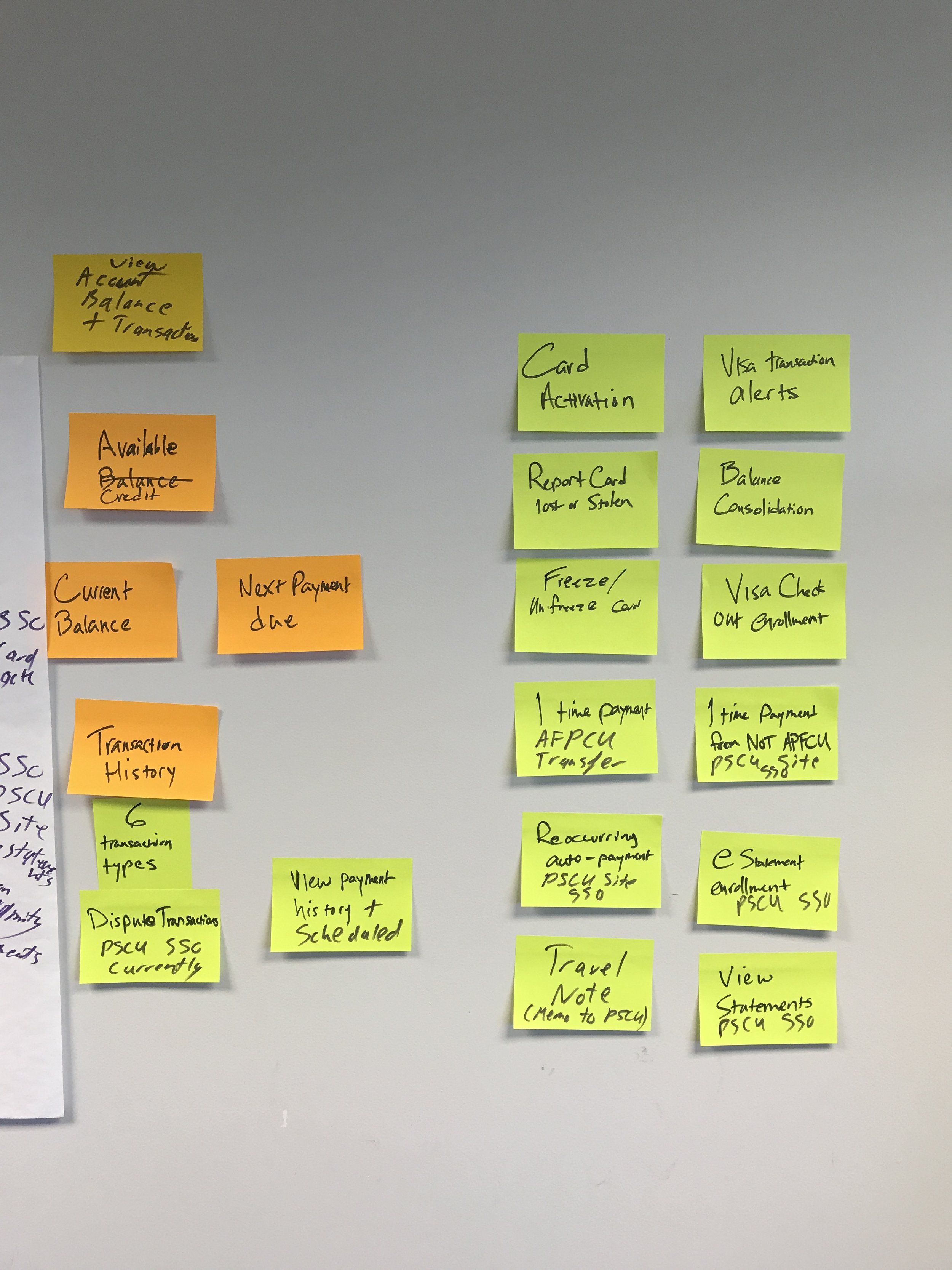
The culture at Affinity Plus aligned perfectly with user-centered design practice since they centered members’ needs around every decision. This organizational mindset allowed me to achieve buy-in for user research and for it to become a welcomed practice. I hired a dedicated research lead and partnered with them to meet with new and long-time members to gather feedback through various activities like contextual interviews, kano analyses, and card-sorts.
The information we gathered influenced the information architecture and features in the updated mobile banking app and helped ensure we were designing right for our users and members.
Developer Partnership
On the development side, I worked with a dedicated external development team specializing in mobile banking apps. Two team members worked on-site to ensure the development matched the design intent. I brought the developers to research sessions in this highly collaborative partnership to experience first-hand user feedback.
Launching version one
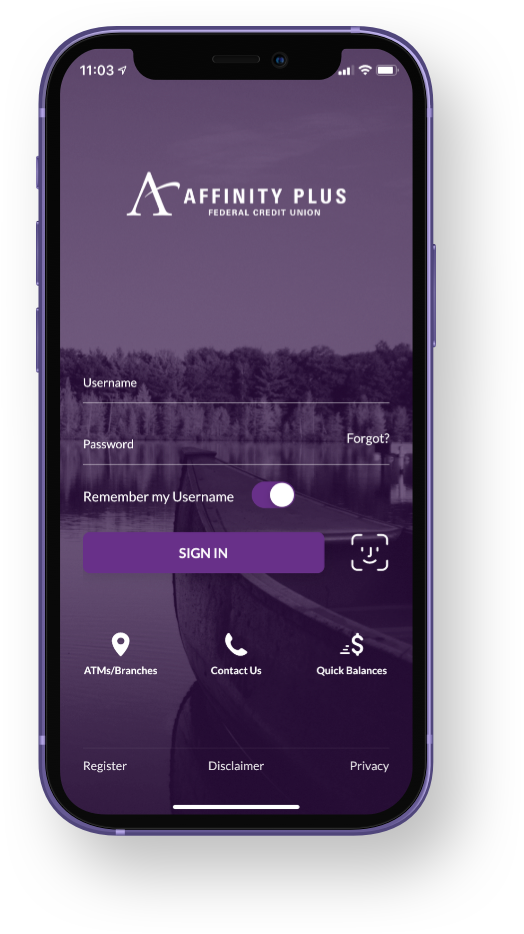
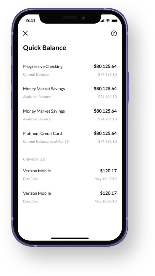
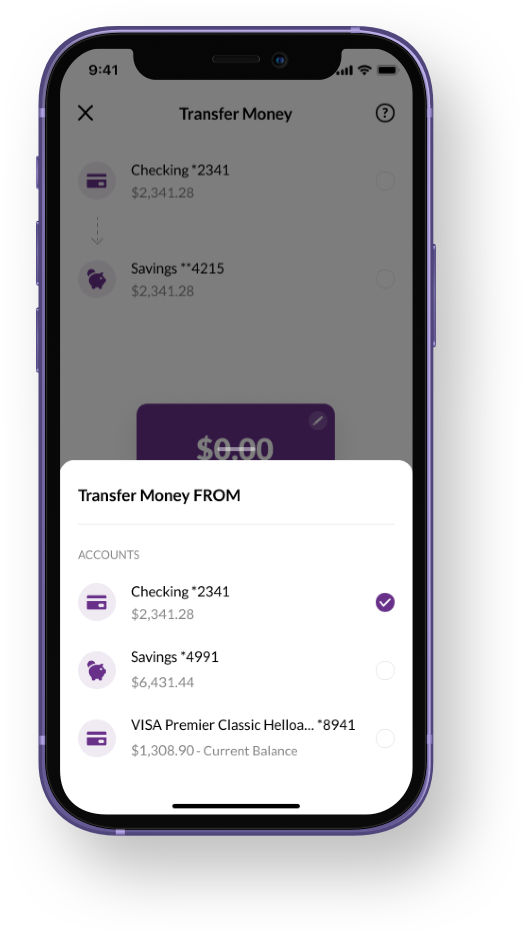
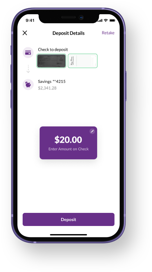
With the launch of the new app, I included features members had been begging for, like the ability to securely log in using Touch or Face ID instead of keying in a complex password. Members could also see their account balances on one screen and instantly transfer money between them. Beyond that, I included features members didn’t know they needed, like getting a quick preview of their account balances without even having to log in and the ability to freeze their credit cards temporarily. They were also delighted by the ability to take photos of their checks and have those funds available instantly, saving them a trip to a physical branch or ATM.
In the first week after launch, it was clear our collective effort's results delivered an improved user experience when the App Store rating increased from 1.4★ to 4.8★. Affinity Plus also received unsolicited positive feedback via phone calls and email.
Not a destination but a journey
Delivering the new app was only the beginning, and we weren’t ready to rest on our laurels. My team and I would continue to learn from our members to further deliver enhancements and features to ensure we maintained a high rating over time.
Ongoing research identified the top tasks in the app that the team and I referred to as Red Routes: features that were essential to the experience and should always take top priority. For example, account balances should have immediate visibility and never be interrupted by another screen after users sign into their accounts.
Capturing a moment of working with my team to unpack user research
I created and maintained a style library to ensure a unified experience between the app and online banking to guide our digital products' visual and interaction design decisions. (Later, when the marketing team initiated a brand refresh, I was able to share our style guide and communicate the needs for digital styles and meeting accessibility requirements.)
Results
My design work positioned Affinity Plus to show we could keep pace with and even challenge the “big banks” of the world. The new app platform allowed my team and me to continue to deliver new value to our existing members and increase memberships.
The new mobile apps became prominent selling points, utilized by the marketing team to attract new members to choose a financial institution to bank with. We had members who decided to switch from their previous bank because they wanted to be able to use the app!

